The Myth of the Perfectly Clear Stadium Sign
Stadium wayfinding works better when signs use consistent words, clear placement and a strong visual hierarchy, helping spectators choose the right route.
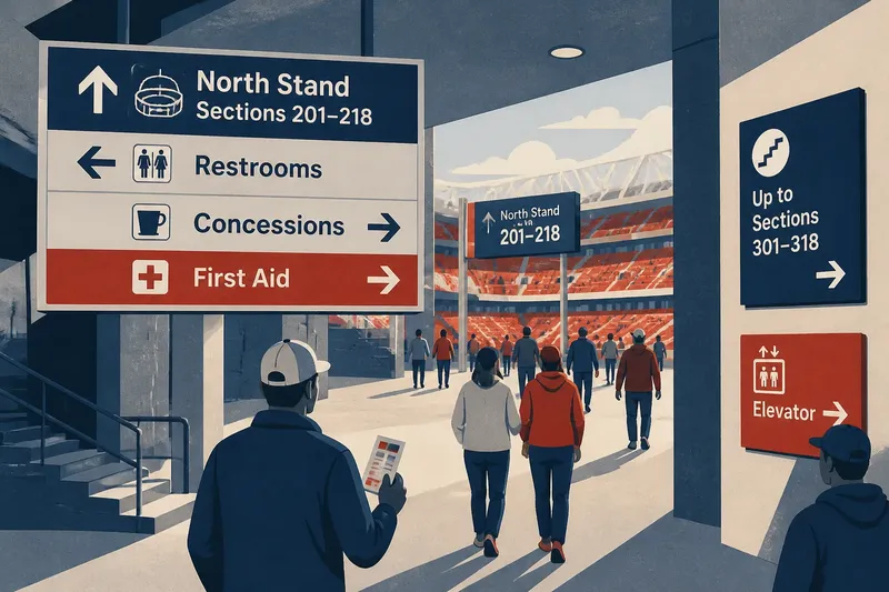
A stadium wayfinding system becomes harder to use when every uncertain turn gets another sign. The fix is not simply larger lettering or more arrows: spectators need consistent wording, clear placement and a visual hierarchy that helps them choose the next route without competing messages.
For an operations team, that means treating signs as a connected sequence. A person entering from a transit stop, parking area or accessible drop-off should encounter the same destination names and follow them through the concourse to the correct entrance, gate or facility.
What should a spectator find first?
Start by listing the decisions people must make, not the signs already installed. Common destinations include entrances, seating sections, restrooms, concessions, first aid, elevators and exits. Add only destinations that matter at the point where a visitor must choose a direction.
Separate destinations into levels. The main level might identify a stand or concourse; the next might identify a block or section; a later sign can direct people to a row or amenity. Putting every destination on every sign erases those levels and makes the important choice harder to spot.
Walk the route from each arrival point. Note every fork, doorway, change of level and place where a visitor could plausibly choose the wrong route. Also mark places where people can pause without blocking others. These decision points—not every stretch of wall—are the likely locations for directional signs.
Keep a route map and a destination list together. A sign is useful only if it answers a question the visitor has at that location.
How do you make the wording consistent?
Choose one name for each destination and use it everywhere. If a venue calls a seating area “North Stand” at the entrance, avoid switching to “North Tier” on the concourse or “N” on a later sign unless that abbreviation is clearly established and repeated consistently.
Use language visitors can match to their ticket or what they see around them. If tickets say “Section 214,” the directional system should not ask people to search for “Block 214” without explaining the relationship. Keep labels short, but do not shorten them so much that a newcomer has to guess.
Decide how to express directions, then stick to the same pattern. Arrows should point toward the route a person should take from the sign’s position; words such as “up,” “left” or “ahead” should clarify a route, not contradict the arrow. When a route changes level, say so in plain language and make the elevator or stair option easy to identify.
Say you are reviewing an invented stadium where signs alternate between “East Gate” and “Gate E.” If the ticket uses “East Gate,” the team can standardize the signs on that name, then carry it through the exterior approach and concourse. The expected observable result is that visitors can match the ticket label to the signs without having to interpret two names for one place.
Where should each sign appear?
Place directional information before the decision, where it can be read while a person still has room to change course. A sign directly above a junction can be too late if a crowd has already carried someone past the turn. At a complicated fork, repeat the direction at the point where the route divides.
Check the view from a standing spectator’s approach, not just from an empty concourse. Temporary barriers, queue lines, open doors, banners and event displays can cover a sign or make its arrow appear to point toward the wrong opening. A sign should be visible from the approach and remain readable as people move toward the choice.
Match placement to the destination. Exterior signs should help visitors reach the right entrance; interior signs should carry them from that entrance toward their section and amenities. Avoid making someone rely on a single sign for a long route with several turns.
For routes that change during an event, use approved temporary signs that preserve the same names, arrows and visual style as permanent signs. Place them where the route actually changes, and remove or cover directions that no longer apply. Venue rules, manufacturer instructions and local requirements govern sign materials, mounting and accessible information.
How should a sign show what matters most?
Give the primary direction the strongest visual position. A person seeking a seat should be able to spot the stand or section before reading secondary destinations such as food, retail or restrooms. Group related information, leave space between groups and use arrows close to the words they describe.
Do not make color carry meaning by itself. A color may help distinguish routes, but pair it with a destination name, letter or symbol so the direction still makes sense when viewed under different lighting or by someone who does not recognize the color scheme. Keep contrast strong between text and background.
Use symbols only when they are familiar and supported by words where ambiguity is possible. A simple restroom symbol can be recognized quickly; a custom icon for a particular stand may not be. Keep type, arrow style and layout stable enough that visitors can recognize the system across the venue.
What questions should you ask before changing the system?
Should every sign show every amenity?
No. Show the destinations relevant to that decision point, then introduce other amenities where their routes branch off. A shorter, ordered set of choices is easier to scan than a crowded directory.
Are digital signs better than fixed signs?
Digital displays can communicate event-specific changes, while fixed signs provide steady route information. Use digital updates for information that genuinely changes, and keep core destination names and route conventions consistent across both formats.
How can staff spot confusing wording?
Ask staff from different departments to follow a route using only the signs and note every moment they hesitate or ask for help. Compare what they call each destination with the wording on tickets, maps and signs, then resolve mismatches at their source.
What should happen when a route is temporarily closed?
Direct visitors to the usable alternative before they reach the closure, then repeat the direction at the diversion. Remove obsolete arrows and make sure staff, temporary signs and digital messages use the same destination names.
How can you review the route before an event?
Walk each approach in the direction a spectator will travel, including accessible routes and paths from transit or parking. At each decision point, ask whether the next sign is visible in time, names the destination as the ticket does and gives one unambiguous direction.
- Destination names: Compare signs with tickets and venue maps; standardize any competing labels.
- Decision points: Check every fork and level change; add direction only where a visitor must choose.
- Visibility: Check from the approach with doors, queues and event displays in place; relocate signs hidden from view.
- Hierarchy: Find the main destination at a glance; reduce or regroup secondary information if it competes.
- Route continuity: Follow the full path to a section, facility or exit; add a sign where guidance disappears before the next choice.
- Temporary changes: Compare diversion signs with current operations; remove directions that lead to a closed route.
Make one change at a time when revising a busy route, then walk it again from the visitor’s starting point. The aim is not to cover every wall; it is to make the next useful choice obvious. That is what turns stadium wayfinding from a collection of signs into a route people can follow.